Forecast KPI
Forecasting is the backbone of supply chain management. By measuring how accurate your predictions are, you can make better decisions, manage inventory more efficiently, and ultimately boost your bottom line.
This guide breaks down the key principles behind forecast KPIs, addresses common challenges, and shows you practical ways to harness Excel for visualizing forecasting trends.
What Are Forecast KPIs?
Forecast KPIs (Key Performance Indicators) are metrics used to measure the accuracy and efficiency of your demand forecasts. They help you answer questions like:
- How close was my forecast to the actual demand?
- Is my forecasting method consistently overestimating or underestimating
- What trends or patterns can I spot over time?
Some common forecast KPIs include:
- Forecast Accuracy: The percentage difference between forecasted and actual demand
- Forecast Bias: Indicates if your forecasts consistently deviate in one direction.
- Mean Absolute Error (MAE): The average of the absolute errors between your forecasts and actual figures.
- Mean Absolute Percentage Error (MAPE): The average percentage error, which gives a relative measure of accuracy
Key Principles of Effective Forecasting
To truly benefit from forecast KPIs, keep these principles in mind:
- Data Quality: Reliable forecasts depend on clean, accurate historical data.
- Consistency: Regularly update your KPIs to track trends over time.
- Actionability: Use the insights to adjust your forecasting methods, inventory planning, and operational strategies.
- Simplicity: Even complex ideas become manageable when broken down into simple metrics.
Common Challenges in Forecasting
- Data Issues: Incomplete or inconsistent data can skew results.
- Seasonality and Trends: Sudden changes or seasonal patterns may not be captured by basic models
- Overfitting vs. Underfitting: Striking a balance between a model that's too rigid and one that is too loose can be tricky
Understanding Forecast Accuracy and Its Bias
Forecast Accuracy
What It Is:
Forecast accuracy measures how close your forecasted numbers are to the actual demand. A common way to calculate it is:
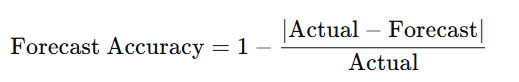
Interpreting the numbers:
• High Percentage: A high accuracy (say, 90–95%) means your forecasts are very close to actual demand.
• Low Percentage: A lower percentage signals larger gaps between forecasted and actual values, suggesting that your forecasting method might need improvement.
Forecast Bias
What It Is:
Forecast bias shows whether your model tends to overestimate or underestimate demand consistently. It is usually computed as the average error:
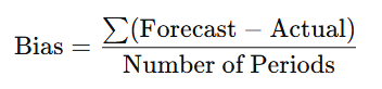
Interpreting the Numbers:
- Bias Near Zero: Ideally, your bias should be close to zero. This means your forecast errors are evenly balanced between overestimations and underestimations.
- Positive Bias: If the bias is positive, your forecasts are generally higher than actual demand, which can lead to overstocking.
- Negative Bias: A negative bias indicates that you tend to underestimate demand, which might result in stockouts and lost sales.
Mean Absolute Error (MAE)
Definition:
MAE is the average of the absolute differences between your forecast and the actual demand. It shows the average error in the same units as your data (for example, units sold).
How to Calculate in Excel:
- Create a new column that calculates the absolute error:
=ABS(Actual - Forecast) - Use the
AVERAGEfunction on this column:=AVERAGE(Absolute Error Range)
Interpretation:
- Lower MAE: Indicates that, on average, your forecasts are closer to actual demand.
- Higher MAE: Suggests larger errors, signaling that you might need to adjust your forecasting method.
Mean Absolute Percentage Error (MAPE)
Definition:
MAPE expresses forecasting error as a percentage, and it’s calculated as the average of the absolute percentage errors.
How to Calculate in Excel:
- Create a column that calculates the percentage error for each period:
=ABS(Actual - Forecast) / Actual - Convert the result to a percentage by multiplying by 100.
- Use the
AVERAGEfunction on this percentage column:=AVERAGE(Percentage Error Range)*100
Interpretation:
- Lower MAPE: Means your forecast errors are relatively small in percentage terms. A MAPE of 5–10% is generally excellent.
- Higher MAPE: Indicates that your forecast errors are significant relative to actual demand. A MAPE above 20% might require you to re-examine your forecasting assumptions.
Practical Comparison
Imagine you run a small retail store. If your MAE is 5 units and your average monthly demand is 150 units, then on average, your forecast is off by about 3.3%. This percentage is essentially what MAPE communicates. Both metrics complement each other:
- MAE gives you a sense of the error in real-world units.
- MAPE tells you how significant that error is relative to the size of your demand.
Interpreting the 4 KPIs together
Forecast Accuracy:
- A high accuracy percentage generally means your forecast is on target. However, check it alongside the other metrics to ensure that high accuracy isn’t masking consistent errors in specific periods.
- Look at the MAE to understand the average error in concrete terms (e.g., units). A low MAE indicates that the magnitude of your errors is small, which is especially useful when comparing forecasts across products or time periods.
MAPE:
- MAPE tells you the relative size of errors compared to actual demand. This is useful when demand volumes vary greatly over time. A low MAPE signifies that your forecasting errors are minimal on a percentage basis, which helps you compare performance even if the demand numbers change.
Bias:
- Bias helps you determine if your forecasting method has a systematic lean. Even if accuracy, MAE, and MAPE look good, a consistent bias (either positive or negative) suggests you may need to adjust your method to avoid chronic overstocking or stockouts.
Improving Your Forecast Based on KPI Analysis
- Identify Systematic Errors:
If your bias is consistently positive or negative, consider introducing a correction factor or revisiting the assumptions in your forecasting model. For instance, if you always overestimate, reducing the forecast slightly might help balance the error. - Adjust for Variability:
A high MAE or MAPE in certain periods (such as seasonal spikes) can indicate that your model isn’t fully capturing variability. Use Excel’s trend analysis or moving averages to incorporate seasonal adjustments. - Combine KPIs for In-Depth Analysis:
Use a dashboard where all four metrics are displayed together. For example, if you see high forecast accuracy but also a high MAPE during low-demand periods, it may indicate that while overall trends are captured well, the model struggles when demand is lower. This insight can drive targeted improvements for those specific periods. - Iterative Refinement:
Forecasting is not a one-time exercise. Regularly review your KPIs after making adjustments. Monitor how changes in your model affect each metric. Excel’s “What-If Analysis” tool can help simulate the impact of various changes before you implement them
Common Mistakes in Interpreting Forecast KPIs
Ignoring Context:
External factors like market trends, promotions, or unexpected events can skew numbers. For instance, a spike in error during a particular month might not be due to a poor forecasting model but an unforeseen event.
Over-Reliance on a Single Metric:
Focusing solely on one KPI (such as forecast accuracy) can hide other issues. Combining multiple metrics gives a fuller picture. For example, pairing forecast accuracy with MAPE and bias can help you spot if a high accuracy rate is masking significant errors in specific periods.
Outdated Data:
Relying on stale data can lead to incorrect conclusions. Regular updates and continuous monitoring are crucial for accurate insights.
Misinterpreting Bias:
A high bias isn’t always bad if it’s consistent and predictable—this might allow you to adjust your model accordingly. However, ignoring bias can lead to systematic errors in inventory and resource planning.
Overcomplicating the Analysis:
While it’s tempting to dive into every metric, simplicity often yields clarity. Focus on the key numbers and trends first, then drill down into specifics if needed.
Practical Example
Imagine you manage forecasts for a product line where:
- Forecast Accuracy is 92%, indicating a generally strong performance.
- MAE is 7 units, which is acceptable relative to an average demand of 200 units.
- MAPE is 8%, suggesting that errors are low on a percentage basis.
- Bias is +4 units, meaning you tend to overforecast slightly.
In this scenario:
- The high accuracy, low MAE, and low MAPE are positive indicators.
- The positive bias, however, suggests that you’re consistently predicting slightly higher demand.
To improve, you could adjust your model to reduce the forecast by a small margin, then monitor if this brings the bias closer to zero while maintaining the strong performance in the other metrics.
🛀Shower Thoughts
- Take a look at your forecast data in Excel and identify one area where a KPI could highlight a potential improvement
Ready to dive even deeper into supply chain insights? Sign up now for our newsletter and get clear, actionable articles delivered straight to your inbox—no spam, just valuable tips to boost your forecasting and supply chain strategies. Join our community today!