Regression Analysis
Demand forecasting involves predicting future sales to help businesses plan more effectively. One common method is regression analysis, a statistical tool that helps identify the relationship between various factors and demand.
This article will explain the key principles of regression analysis, discuss common challenges, and demonstrate how Excel can aid in analyzing data.
What is Regression Analysis?
Regression analysis helps you determine how a change in one factor affects another. Here’s how it works:
Basic Idea: You examine two types of data:
Independent Variable: The factor that influences demand (e.g., advertising spend, price changes).
Dependent Variable: The outcome you want to predict (e.g., sales volume).
The Regression Equation: In simple linear regression, Demand = (Coefficient × Factor) + Constant. This shows how much demand changes when the independent variable changes by one unit.
Real-World Example: If you run a retail shop and suspect your advertising budget impacts sales, regression analysis can help you predict future sales based on your planned advertising spend.
Excel for Data Visualization and Analysis
Excel is excellent for regression analysis, with built-in tools for calculating equations and creating visualizations. Here’s a quick guide:
1. Organize Your Data
Data Layout: Arrange your data in two columns: one for the independent variable (e.g., advertising expenditure) and one for the dependent variable (e.g., sales). Example layout:
|
Month |
Advertising Spend in USD$ |
Sales in USD$ |
|
Jan |
$1000 |
$5000 |
|
Feb |
$1200 |
$5500 |
|
Mar |
$900 |
$4800 |
2. Using the Data Analysis Toolpak in Excel
- Activate the Toolpak:
File > Options > Add-ins and enable the “Analysis ToolPak.” - Run Regression:
- Go to the Data tab and select Data Analysis.
- Choose Regression.
- Specify your Input Y Range (Sales) and Input X Range (Advertising Spend).
- Click OK to see the output, which includes coefficients, R-squared values, and p-values.
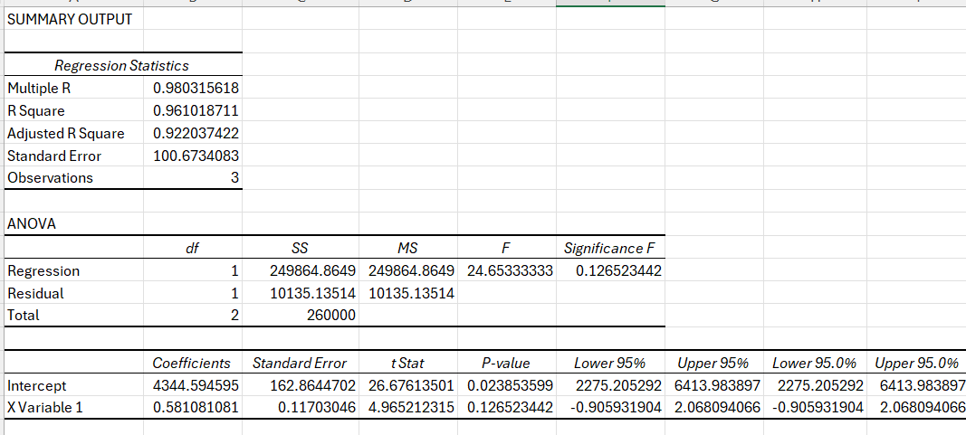
3. Interpreting the Output
- Coefficient:
Shows how much your sales are expected to increase for every additional dollar spent on advertising. - R-squared:
Indicates how well the regression model fits your data (a higher value means a better fit)
4. Visualizing the Data
- Scatter Plot with Trendline:
Create a scatter plot of your data points.- Click on your data, then go to Insert > Scatter.
- Once the plot is created, right-click on a data point and select Add Trendline.
- In the options, choose to display the equation on the chart. This gives you a quick visual and mathematical representation of your regression analysis.
Tip: Using the trendline helps you spot any outliers or irregular patterns that might affect your forecasting accuracy.
Common Challenges in Regression Analysis
Even though regression analysis is powerful, there are a few common challenges to be aware of:
- Data Quality:
Inaccurate or incomplete data can lead to misleading results. Always clean and verify your data before analysis. - Overfitting:
If your model is too complex (e.g., using too many variables), it may fit your historical data perfectly but fail to predict future trends. - Assuming Causation:
Just because two variables move together doesn’t mean one causes the other. For example, both ice cream sales and sunglasses sales may increase in summer, but one does not cause the other. - Ignoring External Factors:
Sometimes, external events (like economic shifts or natural disasters) can significantly impact demand, and these factors might not be captured in your data.
Excel: Forecasting Retail Sales
- Data Collection:
Gather monthly data on your advertising spend and corresponding sales. - Run the Regression:
Use Excel’s Data Analysis Toolpak to run the regression. Suppose you find:Coefficient: 4.5 (meaning each additional dollar in advertising might bring in an extra $4.50 in sales)Constant: 3000 (baseline sales without advertising)R-squared: 0.85 (a good fit) - Making Predictions:
If you plan to spend $1,500 on advertising next month, plug the value into your equation:
Forecasted Sales = (4.5 × 1500) + 3000 = 9750 - Visualization:
Create a scatter plot with your historical data and add the trendline with the regression equation displayed. This helps you quickly see how your future forecast fits the overall trend.
Some Questions to Ponder Before You Leave
- How reliable is your data, and have you factored in potential external influences?
- Could other variables (like seasonality or market trends) improve your forecasting model?
- How might you adjust your model if you notice an outlier or sudden trend change?
Ready to dive even deeper into supply chain insights? Sign up now for our newsletter and get clear, actionable articles delivered straight to your inbox—no spam, just valuable tips to boost your forecasting and supply chain strategies. Join our community today